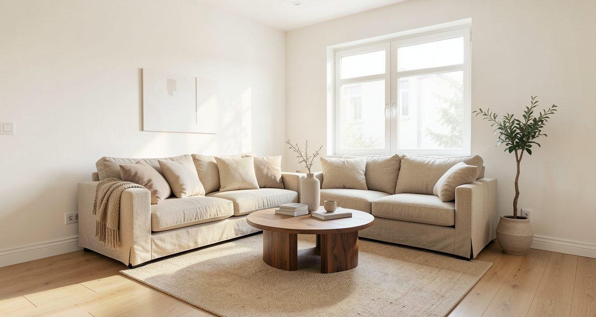
Living room paint colors: start with light and undertones
The safest living room paint color is usually a warm, slightly softened white or a light greige, which is a blend of beige and gray. Match it to your floor and to the way daylight enters the room. A deeper, saturated color can look great too, but it works best as a deliberate choice, starting with a single wall.
Start with the things you cannot change easily: the floor, a large sofa, the window frames and, if the living room is open to the kitchen, the kitchen colors. You choose the walls to suit them, not the other way around, because paint is far easier to change than a floor.
Many colors have an undertone, a hint of another shade that shows through the main color and shifts it slightly. An undertone can be warm or cool. Warm wood usually looks more harmonious with a warm white, while a cool white next to yellow oak can look out of place. So decide on the undertone first and the exact shade second.
- Note which way the windows face and when you usually sit in the room. A wall can look different in morning light than in the evening under lamps.
- Judge the undertone of the floor and of the biggest piece of furniture. Hold a sheet of white paper next to them and see whether it looks warmer or cooler beside each one.
- Pick two or three test colors and paint them on large sheets or patches of wall. A small dab from a color card will not show how the color behaves across a whole wall.
- Look at the samples in the morning, at midday and in the evening, including with the lamps on. Decide only after a full day.
A screen is not a swatch
Treat a color from a photo, a catalog or a visualization as inspiration. Always check the paint on a large sample in your own living room, in your own light.
Living room wall colors with gray floors and oak floors
The floor takes up the most space in a living room and is hard to hide, so it is an easier starting point than the wall. Below are the three most common situations and the colors we suggest testing first.
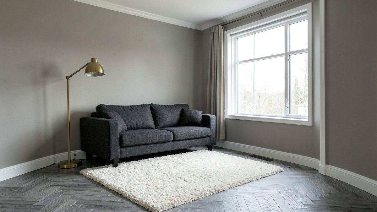
Wall colors for a gray floor
A gray floor leaves a lot of freedom, so the wall can either warm it up or emphasize its coolness. Warm white and light greige give a soft, calm result. A muted sage green adds life and looks good with wooden accessories. Avoid a wall in almost the same gray as the floor, because the room can feel flat. If you go that way, add contrast with textiles, wood and lamps.
Wall colors for an oak floor
Oak usually has a warm tone, so many colors suit it: warm white, sandy beige, a creamy shade or a muted green such as sage or olive. Oak comes in many shades, from pale and bleached to golden and dark, so hold a paint sample directly against the floor. A cool, bluish white next to warm oak can look harsh.
What about a dark floor
With a dark floor, light walls usually help by balancing the weight at the bottom of the room. A dark floor with dark walls makes a closed-in, heavy living room that suits spaces with plenty of daylight and good evening lighting. If you like that look, keep the ceiling light.
What color to paint a living room with dark furniture
Dark furniture, such as walnut, charcoal or black pieces, can be paired with walls in two ways. The first is light, warm walls, where a warm white or a very light beige sets the furniture apart and shows off its shape. A light wall behind a dark bookcase makes it look like a deliberate accent instead of a dark patch.
The second is a dark wall chosen on purpose, for example deep green, navy or charcoal behind the sofa or the bookcase. The furniture and the wall then blend into one calm, enveloping whole. Such a living room needs good evening light, so plan several sources: a floor lamp, a wall light and a lamp by the sofa.
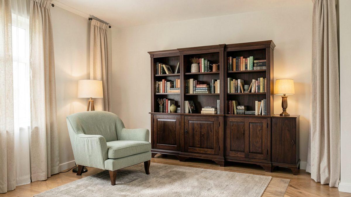
Whichever you choose, textiles and light help soften the contrast. Linen curtains, a wool or light rug, soft cushions and warm-toned lamps keep dark furniture from dominating the rest of the room. If the living room is open to the kitchen, choose wall and cabinet colors together. We cover that in our guide to open-plan kitchen and living room ideas.
Small rooms and rooms with little natural light
In a small living room, light walls usually work best, because the room then feels brighter and calmer. A dark color on all four walls can make the room feel tighter, especially when it has only one window.
If you are drawn to a darker color, paint one wall, ideally the one you see when you walk in or while sitting on the sofa. Leave the others light. You add depth and character without making the room heavy.
You can paint the ceiling and the baseboards in the same tone as the walls or in a lighter one. Fewer breaks mean a calmer picture, and the eye travels more easily across the whole room. With weak daylight, avoid colors with a cool, gray undertone, because without sun they can look gloomy. Warm white or sandy beige usually does better.
6 combinations that work in most living rooms
The combinations below are our editorial suggestions for where to start testing. Check each one on a large sample, because a shade from the same palette can look different depending on the window and the lamps.
| Combination | Wall color | Pairs well with | Watch out for |
|---|---|---|---|
| Warm white and oak | warm, slightly creamy white | light or medium oak, linen textiles, wooden furniture | a cool white next to yellow wood can look gray |
| Greige and gray | light greige | a gray floor, a charcoal sofa, cool accessories | a greige that is too dark can look heavy in weak light |
| Sage and linen | muted sage green | oak, linen curtains, natural accessories | a green with a bluish undertone next to warm wood; check the sample |
| Beige and walnut | sandy beige | walnut furniture, copper and brass accessories | a beige with too pink an undertone can clash with wood |
| Navy accent | one navy wall, the rest light | a light floor, white and wooden accessories | navy on all the walls works better in a well-lit room |
| Terracotta accent | one wall or niche in terracotta | beige, linen, dark wood | a saturated color over a large area can look stronger than the sample |
If you cannot decide, choose a combination with warm white or beige, the first or the fourth. It is easy to refresh later with cushions, curtains and pictures, without repainting the walls.
Living room paint colors 2026 without chasing trends
Color fashion changes, and living room walls usually stay longer than accessories. That is why we do not rely on any color-of-the-year list here. The combinations above do not depend on fashion, because they follow from the floor, the furniture and the light.
If you like a trendy color, bring it in where it is easy to replace: cushions, curtains, a poster, a vase or one accent wall. Keep the main walls in a color you will still like next year. That way you update the room without a full renovation.
The same rule works outside the house, with the fixed element first and the color matched to it afterwards. We show how that looks with a roof and a facade in house colors that go with your roof.
Before you buy paint, test it on a large sample. Leave it on the wall for a few days and look at it at different times of day, including in the evening under lamps if that is when you usually sit in the living room.
What zabudowa.arch does and does not do
If you are torn between two colors, you can see them on a photo of your own room in a free AI living room design app, zabudowa.arch. You take a photo with the camera or pick one from the gallery, describe the wall color in your own words, and after about a minute you get three designs (A, B, C), each with a name and a description. You compare them with the original using a before/after slider.
You can choose up to two changes at once: wall color, ceiling, lighting, curtains and blinds, floor or an accent wall. You can also pick a full style change, for example Scandinavian or warm minimalism.
What the app does not do
Windows, doors, walls and the layout of the room stay in place, and the app does not plan the layout or dimensions. The designs are AI images for inspiration, so colors and materials can look different in real life. A visualization does not replace a paint sample, so check the paint on your wall.
The app is free within a daily and monthly limit and does not require an account. It is an Android app.
Frequently asked questions
What is the safest paint color for a living room?
A warm, slightly softened white or a light greige, matched to the undertone of your floor, is the safest choice. Both suit many kinds of furniture, and colorful accents are easy to swap for cushions or curtains. Always test the paint on a large sample in your own living room in the morning, at midday and in the evening under lamps.
What wall color goes with gray floors?
Warm white, light greige and a muted sage go well with a gray floor. Warm walls soften the coolness of the floor, and sage adds life. Avoid a wall in almost the same gray as the floor, because the room can feel flat, unless you add contrast with textiles and wood.
What wall color goes with oak floors?
Warm white, sandy beige and a muted green such as sage suit oak floors. Oak ranges from pale to golden, so hold a paint sample directly against the floor. A cool, bluish white next to warm wood can look harsh.
What color to paint a living room with dark furniture?
Choose light, warm walls that set the furniture apart, or a deliberately dark wall if the room has good light. In both cases soften the contrast with textiles, linen curtains, a light rug and warm lamps, so the room does not feel heavy.
Do dark walls make a living room look smaller?
They can, especially when all the walls are dark and the room gets little light. It is easier to use a dark color on one wall, such as the one you see when you walk in. In a large, bright living room a deep color can look elegant, so check a sample first.
Will the color in an AI visualization match real paint?
Not always. The visualizations in the zabudowa.arch app are AI images for inspiration, and colors and materials can look different in real life. A visualization helps you choose a direction, but always check the paint on a large sample in your own living room, in your own light.
Sources and the nature of this advice
This article contains editorial interior design advice, not research data or paint manufacturers' recommendations. Treat the colors and combinations as a starting point for your own tests. For coverage, yield and wall preparation, check the product sheet of the paint you choose, and ask a contractor if the renovation is larger.
See wall colors on a photo of your living room
Take a photo of your living room in the zabudowa.arch Android app and compare three designs before you buy paint. Start with the free AI living room design app.
Get it on Google PlayRelated articles
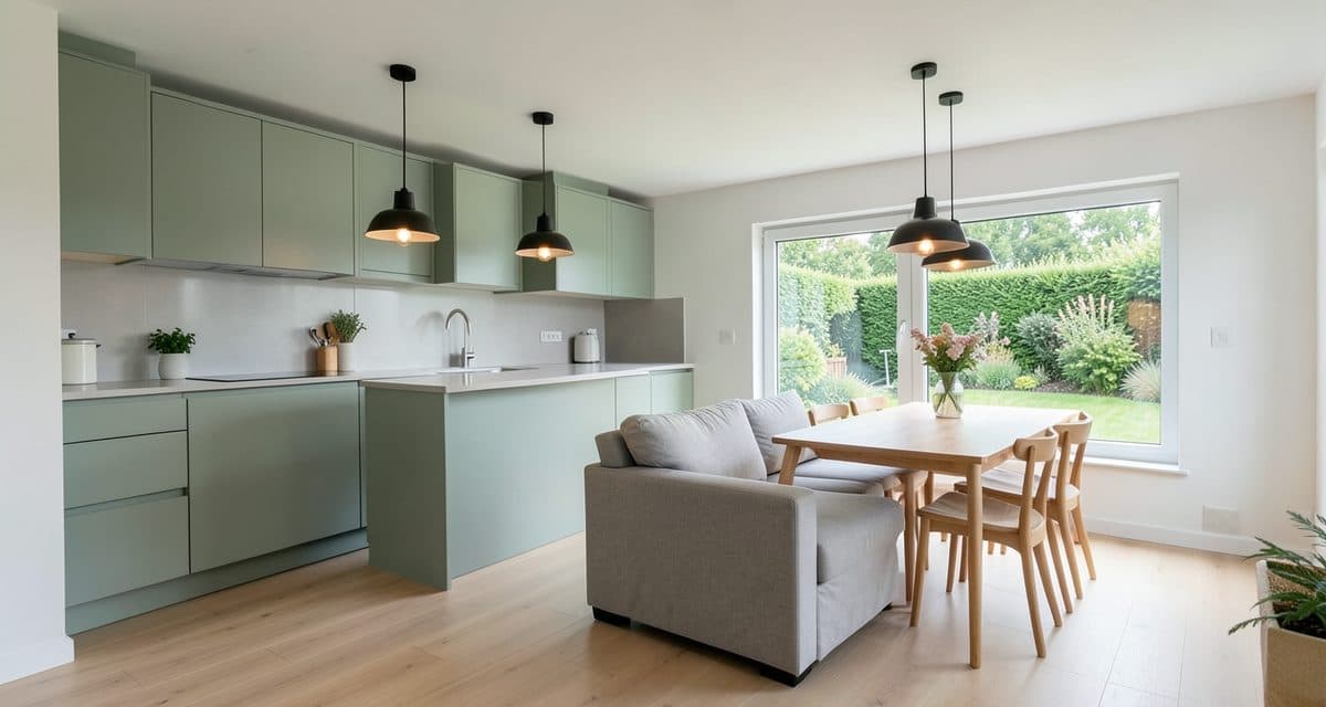
Open Plan Kitchen Living Room Ideas: Colors, Light and Materials That Tie It Together
Open plan kitchen living room ideas: how to choose colors, materials and lighting so both zones read as one room, and how to preview the result on a photo.
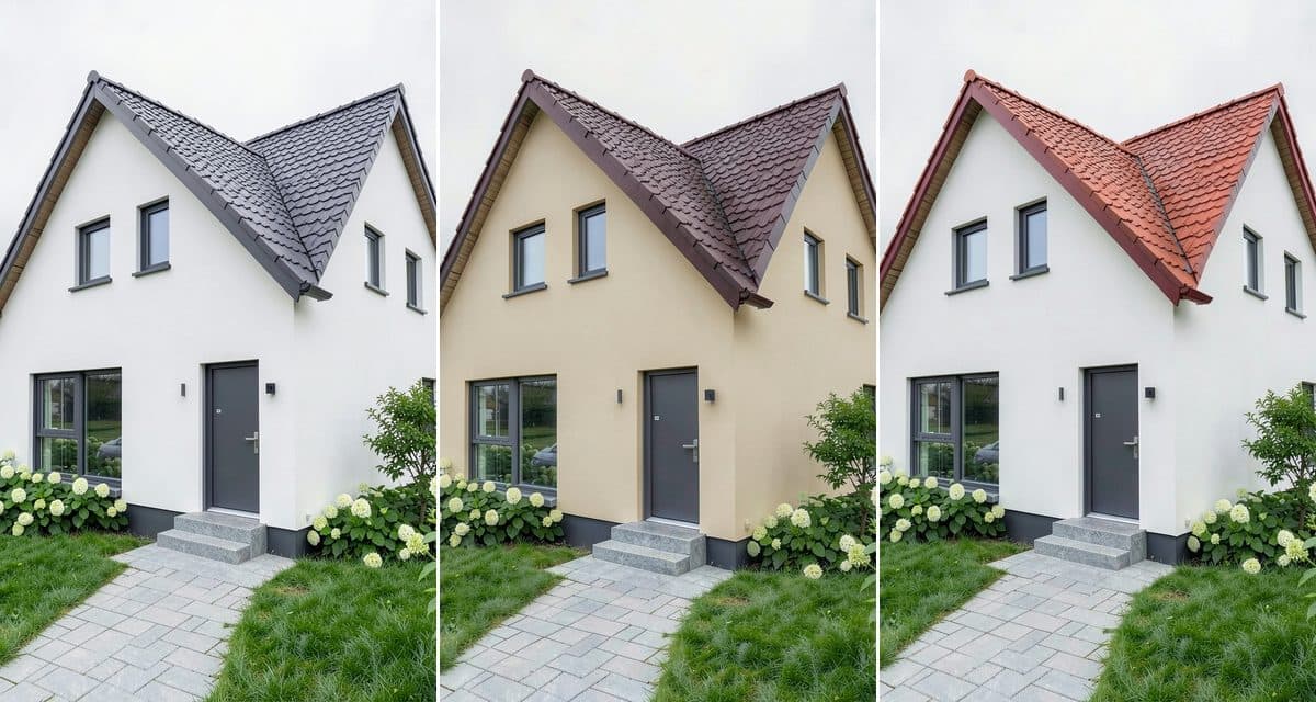
What Color House Goes With a Black, Gray, Brown or Red Roof? Pairings Shown on One House
What color house goes with a black, gray, brown or red roof? Pairing charts with trim and windows, shown on one house, plus a way to test your own photo.
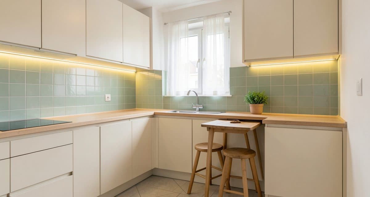
Small Apartment Kitchen Ideas: Colors, Storage and Light
Small apartment kitchen ideas: how to pick a layout, cabinet colors, worktop, lighting and storage, and how to preview a look on a photo of your own kitchen.